30 Day Chart Challenge Gallery
Welcome to my #30DayChartChallenge gallery!
Every April, the #30DayChartChallenge brings together people from around the world to explore data through daily visualizations. The challenge follows a simple idea: create one chart per day for 30 days, guided by themes (such as comparisons, distributions, time series) and prompts (such as circular, trade, evolution).
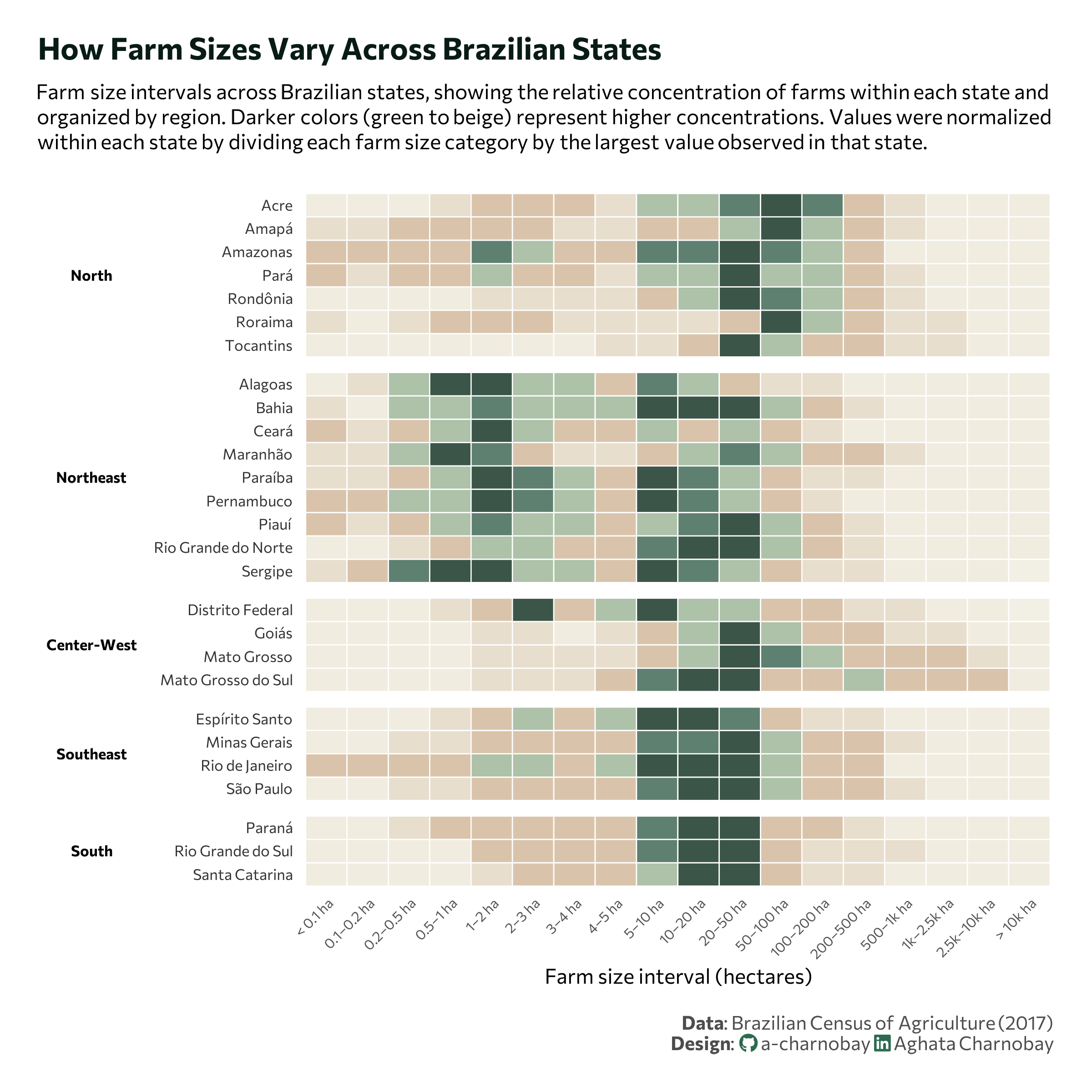
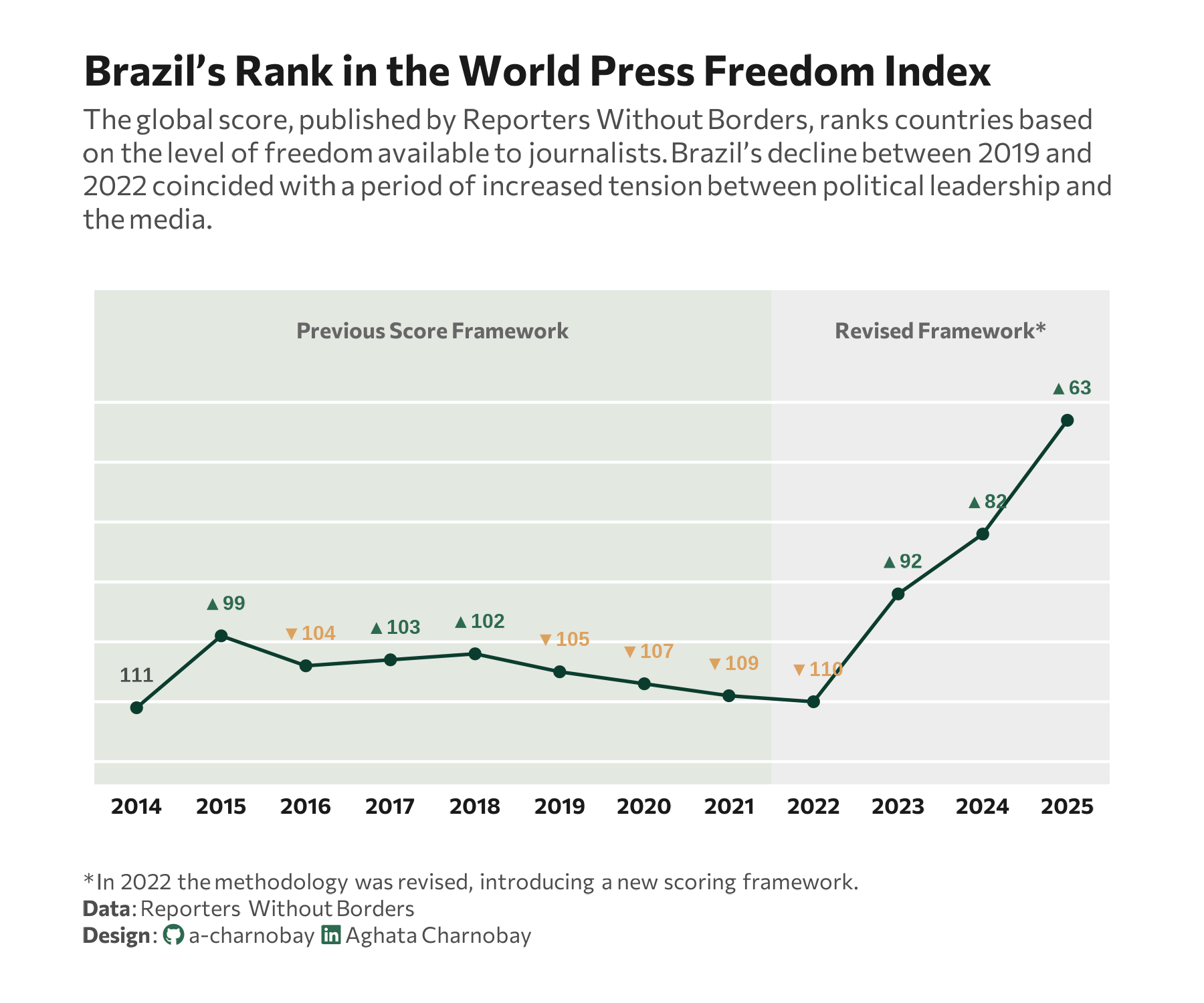
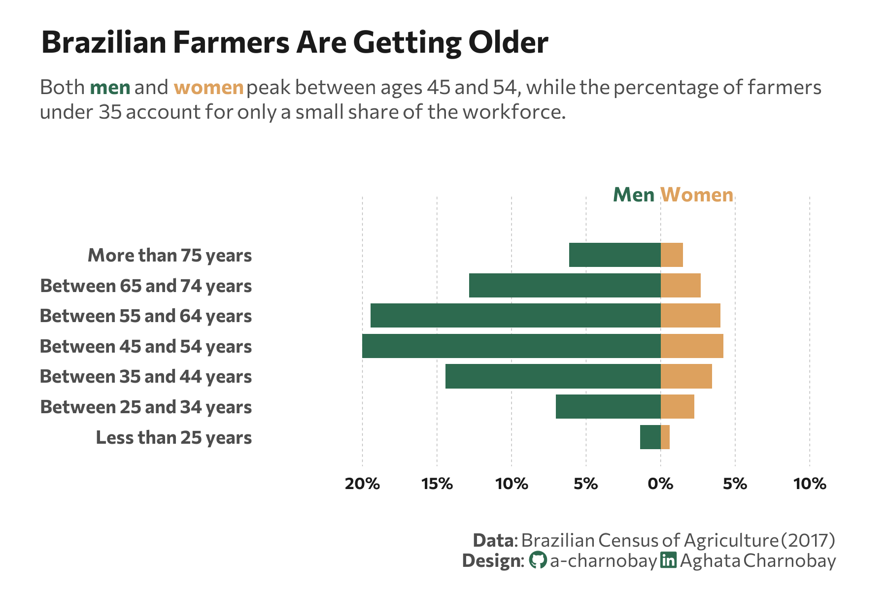
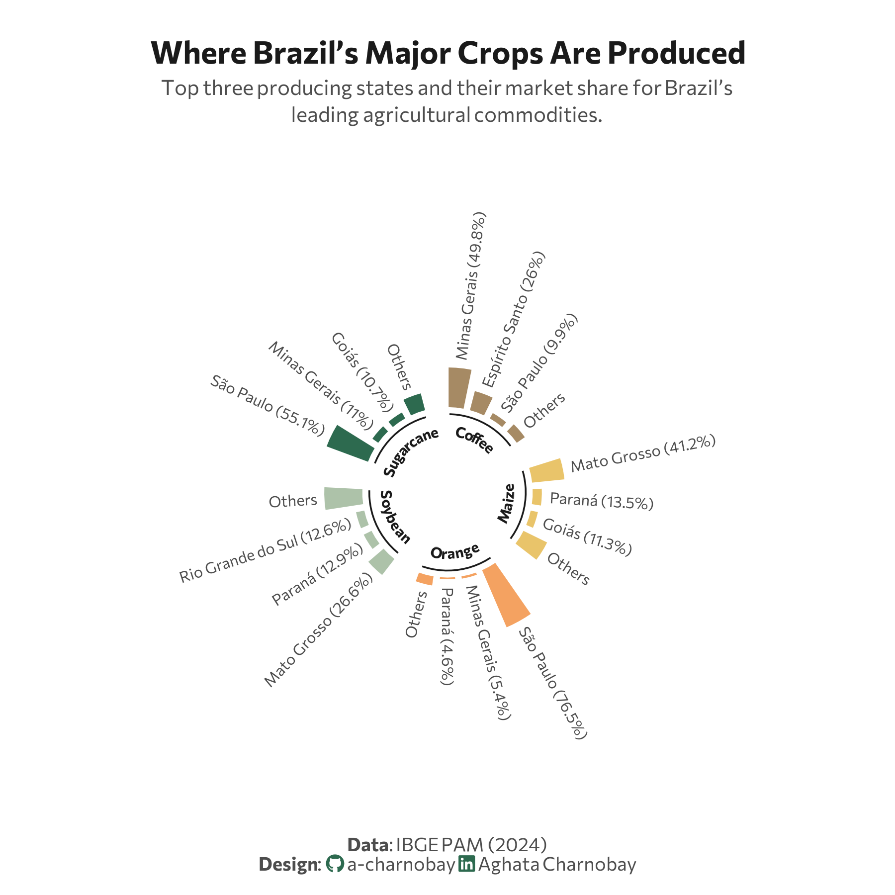
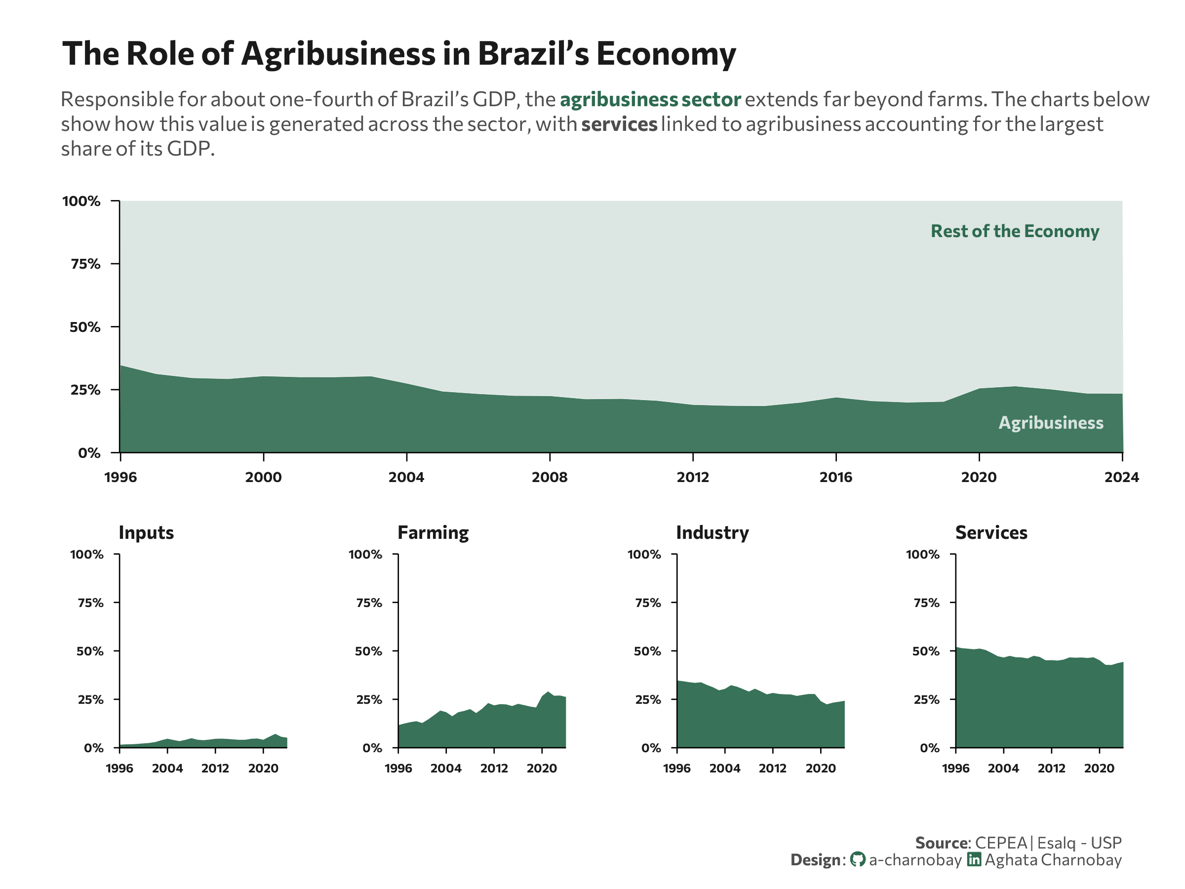
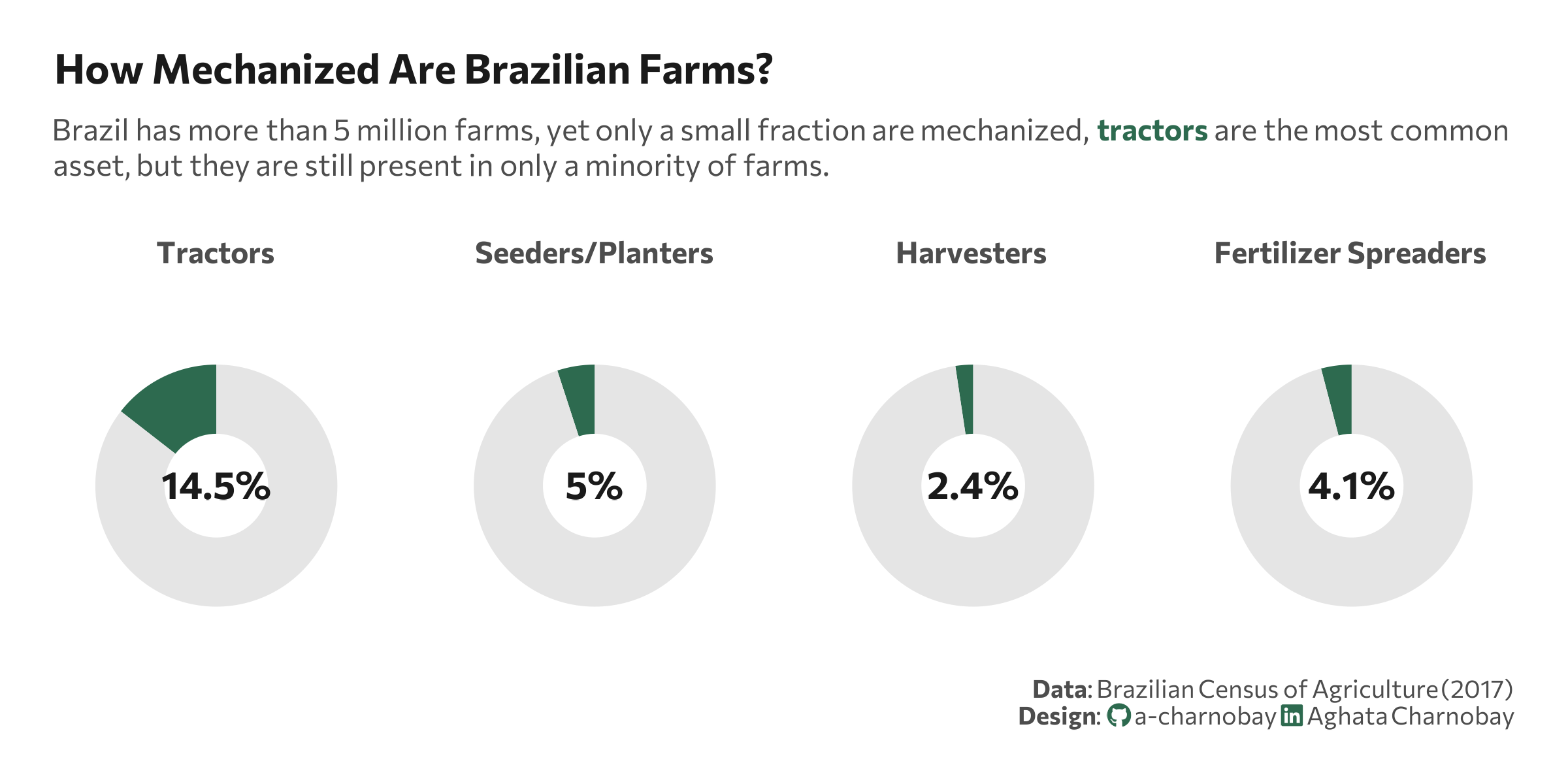
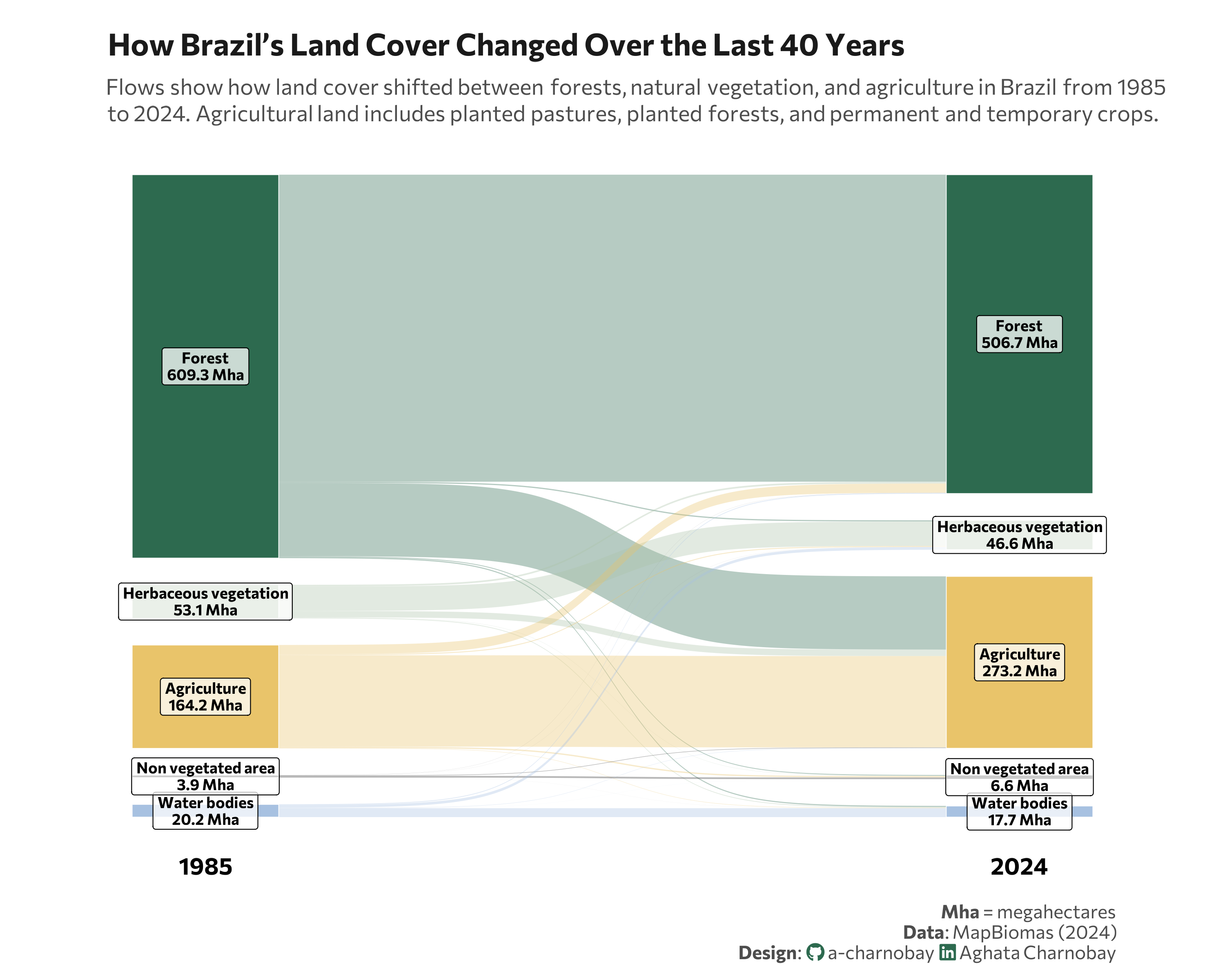
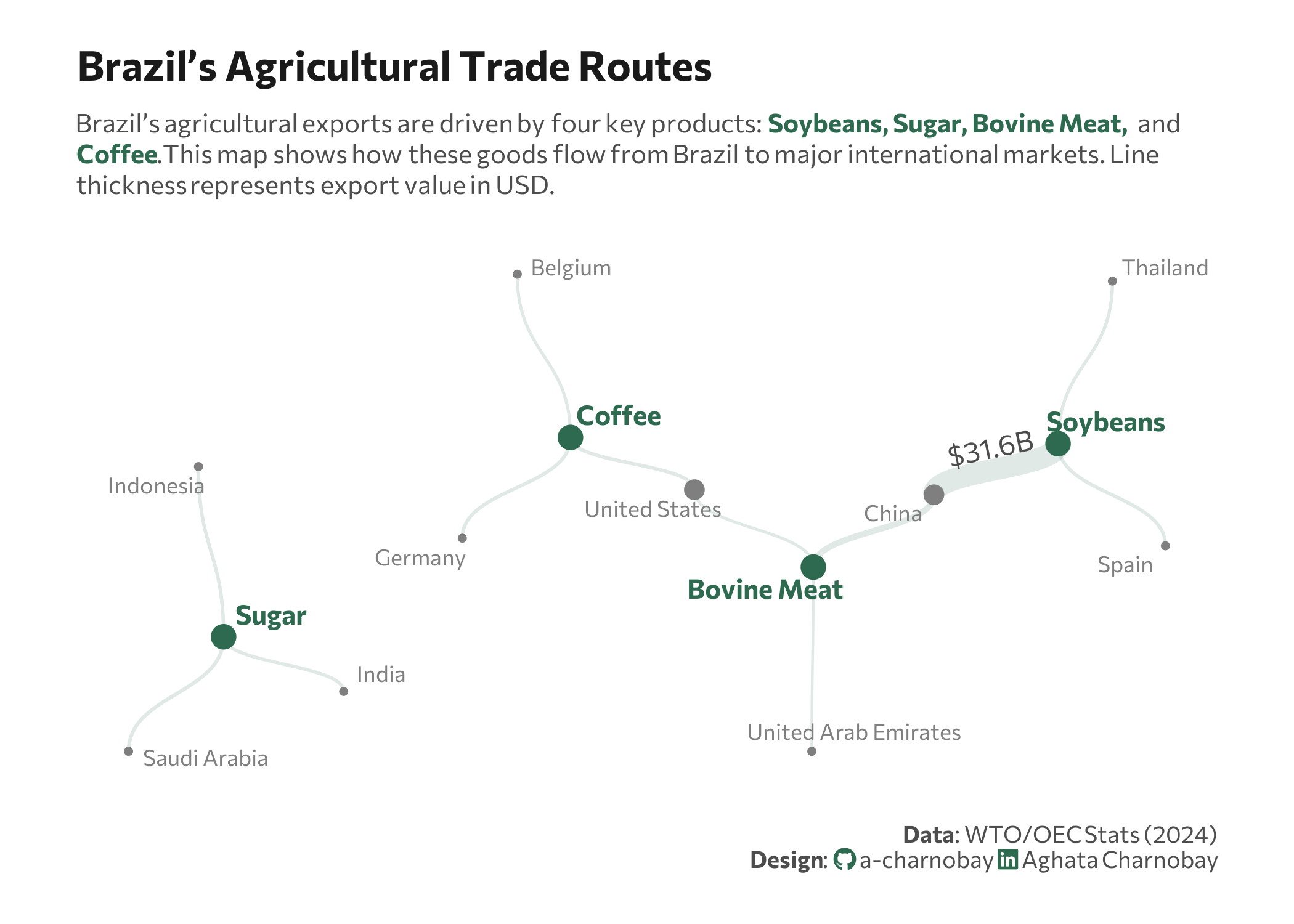
This year I joined for the first time and chose to explore datasets related to Brazilian agriculture—a topic closely connected to my background and interests.
Each chart in this gallery includes the visualization along with the code used to create it. I hope you enjoy exploring these daily experiments as much as I enjoyed creating them!
Comparisons
No matching items
Distributions


No matching items
Relationships


No matching items
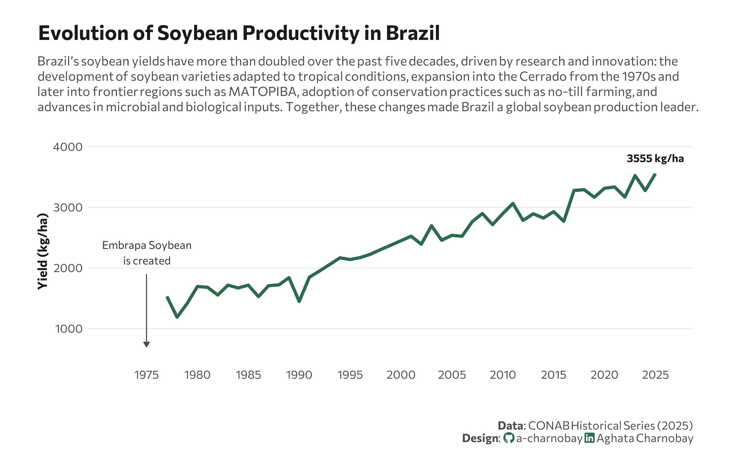
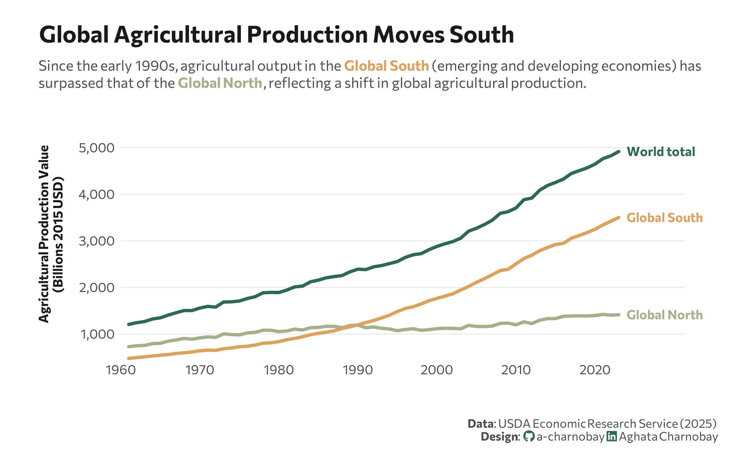
Time Series


Uncertainties


No matching items