library(tidytext)
library(ggtext)
library(showtext)
library(stringr)
library(tidyverse)
library(here)
library(readxl)06.Reporters Without Borders Data Day
Comparisons
Timeseries
1 Setup
1.1 Load R packages
1.2 Load data
df <- read_excel("reporters_withouth_borders_brazil.xlsx",
    na = "NA")
1.3 Set theme
# Font setup
font_add_google("Commissioner")
showtext_auto()
showtext_opts(dpi = 300)
font_main <- "Commissioner"

# Font Awesome for caption
font_add(family = "fa-brands", regular = here("fonts", "Font Awesome 7 Brands-Regular-400.otf"))

# Colors
title_col <- "grey10"
text_col  <- "grey30"
bg_col    <- "#F2F4F8"
col_primary  <- "#0B3D2E"
col_increase <- "#2D6A4F"
col_decrease <- "#dda15e"
2 Prepare data for plotting
df_plot <- df |>
  mutate(
    global_index = as.numeric(str_replace(global_index, ",", ".")),
    global_position = as.numeric(global_position)
  ) |>
  arrange(year) |>
  mutate(
    # Calculate the change in position
    pos_diff = global_position - lag(global_position),
    # Create the label: Rank + Arrow
    arrow = case_when(
      is.na(pos_diff) ~ "",
      pos_diff < 0   ~ " \u25B2",
      pos_diff > 0   ~ " \u25BC",
      TRUE           ~ " \u25A0"
    ),
    arrow_color = case_when(
      pos_diff < 0 ~ col_increase,
      pos_diff > 0 ~ col_decrease,
      TRUE         ~ text_col
    ),
    full_label = paste0(arrow,global_position),
    # Grouping for the methodology break
    period = ifelse(year <= 2021, "Old Method", "New Method")
  )

methodology_zones <- data.frame(
  xmin = c(2013.5, 2021.5),
  xmax = c(2021.5, 2025.5),
  fill_color = c("#B8C5B4", "#D1D1D1"),
  label = c("Previous Score Framework", "Revised Framework*")
)
3 Plot
p <- ggplot(df_plot, aes(x = year, y = global_position)) +
geom_rect(data = methodology_zones,
aes(xmin = xmin, xmax = xmax, ymin = -Inf, ymax = Inf, fill = fill_color),
alpha = 0.4, inherit.aes = FALSE) +
geom_hline(yintercept = seq(60, 120, by = 10), color = "white", size = 0.5) +
geom_text(data = methodology_zones,
aes(x = (xmin + xmax)/2, y = 48, label = label),
family = font_main, size = 2.8, color = "grey40", fontface = "bold", inherit.aes = FALSE) +
geom_line(aes(group = 1), color = col_primary, size = 0.6) +
geom_point(color = col_primary, size = 1.5) +
geom_text(aes(label = full_label, color = arrow_color),
vjust = -1.9, family = "sans", fontface = "bold", size = 2.5) +
scale_fill_identity() +
scale_color_identity() +
scale_x_continuous(breaks = 2014:2025, expand = c(0.01, 0.01)) +
scale_y_reverse(limits = c(120, 45), breaks = seq(40, 120, by = 10)) +
labs(
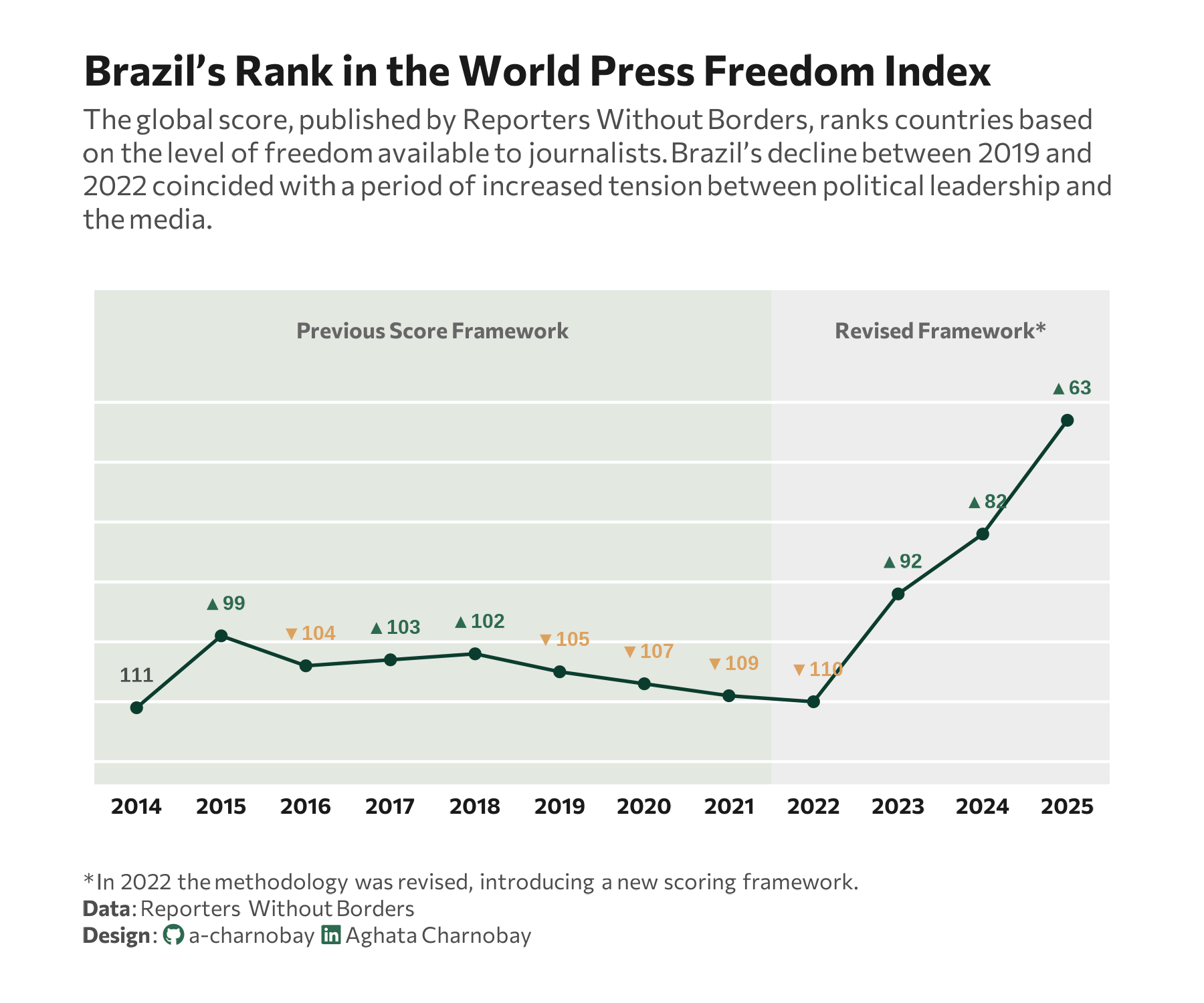
title = "Brazil’s Rank in the World Press Freedom Index",
subtitle = "The global score, published by Reporters Without Borders, ranks countries based<br>on the level of freedom available to journalists. Brazil’s decline between 2019 and<br>2022 coincided with a period of increased tension between political leadership and<br>the media.",
caption = paste0(
"<span>* In 2022 the methodology was revised, introducing a new scoring framework.</span><br>",
"**Data**: Reporters Without Borders",
"<br>**Design**: <span style='font-family:fa-brands; color:#2D6A4F;'></span> a-charnobay ",
"<span style='font-family:fa-brands; color:#2D6A4F;'></span> Aghata Charnobay"
)
) +
# styling
theme_minimal(base_family = font_main) +
theme(
plot.title = element_text(face = "bold", size = 15, color = title_col),
plot.subtitle = element_markdown(size = 10, color = text_col, margin = margin(b = 20), lineheight = 1.2),
plot.caption.position = "plot",
plot.caption = element_markdown(size = 8, color = text_col, hjust = 0, margin = margin(t = 20), lineheight = 1.2),
panel.grid = element_blank(),
axis.text.y = element_blank(), # Kept blank as per your formatting
axis.text.x = element_text(size = 8, face = "bold", color = title_col),
axis.title = element_blank(),
plot.background = element_rect(fill = "white", color = NA),
plot.margin = margin(20, 30, 20, 30)
) +
coord_cartesian(clip = "off")