library(tidytext)
library(ggtext)
library(showtext)
library(stringr)
library(tidyverse)
library(here)
library(ggraph)
library(tidygraph)14.Trade
Relationships
Network
1 Setup
1.1 Load R packages
1.2 Load data
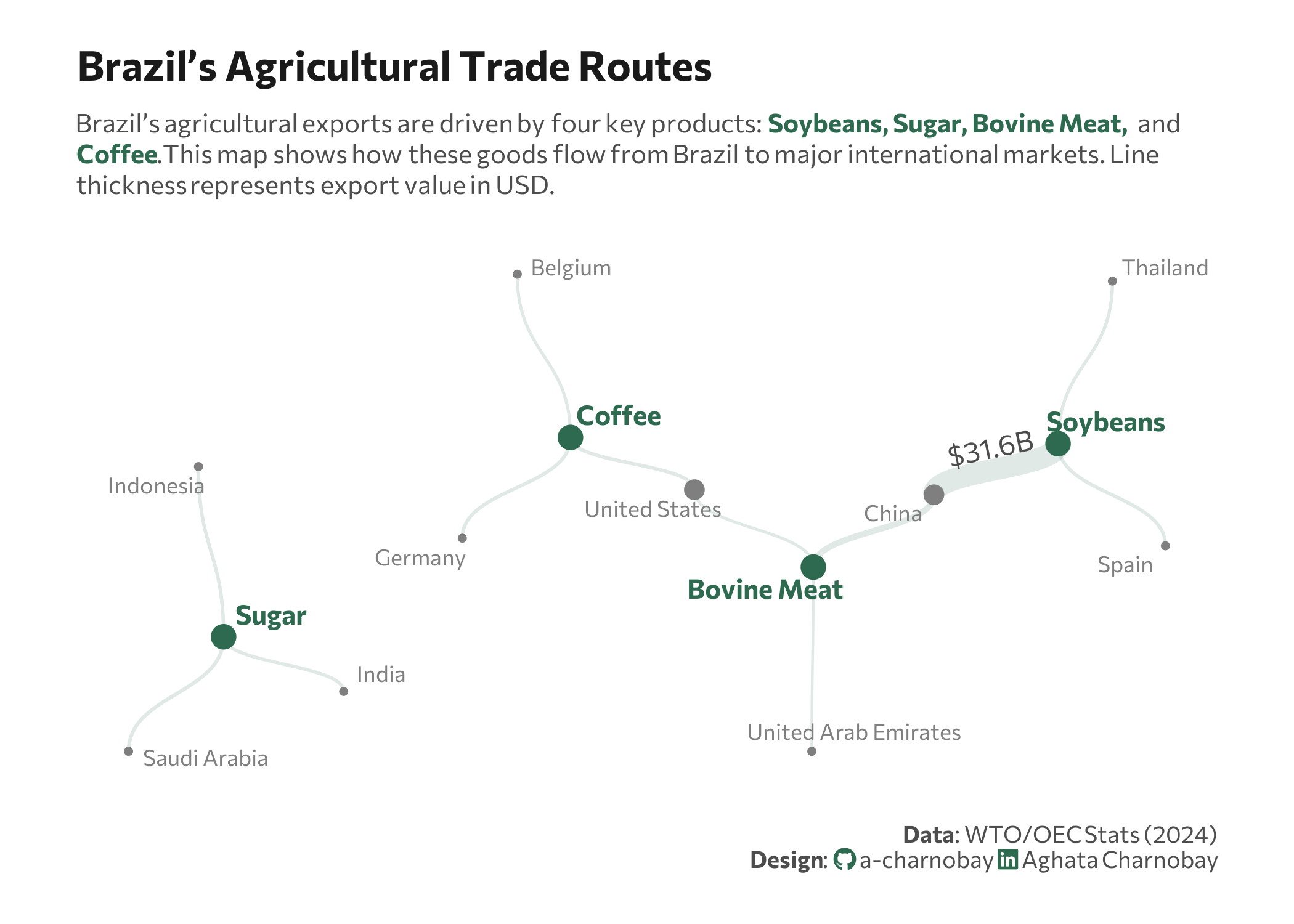
trade_data <- data.frame(
  from = c("Soybeans", "Soybeans", "Soybeans", "Sugar", "Sugar", "Sugar",
           "Bovine Meat", "Bovine Meat", "Bovine Meat", "Coffee", "Coffee", "Coffee"),
  to = c("China", "Spain", "Thailand", "Saudi Arabia", "Indonesia", "India",
         "China", "United States", "United Arab Emirates", "United States", "Germany", "Belgium"),
  value_raw = c("31600", "1800", "1520", "2050", "1700", "1640",
                "5980", "889", "523", "1900", "1820", "1100")
) %>%
  mutate(value = as.numeric(value_raw))
1.3 Set theme
# Font setup
font_add_google("Commissioner")
showtext_auto()
showtext_opts(dpi = 300)
font_main <- "Commissioner"

# Font Awesome for caption
font_add(family = "fa-brands", regular = here("fonts", "Font Awesome 7 Brands-Regular-400.otf"))


# Colors
col_bg        <- "white"
title_col     <- "grey10"
text_col      <- "grey30"
col_highlight <- "#2D6A4F"
col_country   <- "grey50"
2 Prepare data for plotting
graph <- as_tbl_graph(trade_data, directed = FALSE) |>
  mutate(
    # Identify if node is a Product or Country for coloring
    type = if_else(name %in% trade_data$from, "Product", "Country"),
    # Calculate degree (number of connections) to scale node size
    importance = centrality_degree()
  )
3 Plot
set.seed(42)
p <- ggraph(graph, layout = "stress") +
# relationship lines
geom_edge_diagonal(
aes(width = value),
alpha = 0.15,
color = col_highlight,
show.legend = FALSE
) +
# highlight connections
geom_edge_diagonal(
aes(
width = value,
label = if_else(value == 31600, "$31.6B", "")
),
alpha = 0, # Invisible line, only the label shows
color = "transparent",
family = font_main,
size = 2.5,
label_colour = text_col,
label_face = "bold.italic",
angle_calc = "along",
label_dodge = unit(3, "mm"),
show.legend = FALSE
) +
# Hubs
geom_node_point(aes(color = type, size = importance),
show.legend = FALSE) +
# Country labels
geom_node_text(aes(label = if_else(type == "Country", name, NA_character_)),
color = col_country,
size = 3,
family = font_main,
repel = TRUE,
point.padding = unit(0.5, "lines"),
min.segment.length = Inf) +
# Product labels
geom_node_text(aes(label = if_else(type == "Product", name, NA_character_)),
color = col_highlight,
fontface = "bold",
size = 3.7,
family = font_main,
repel = TRUE,
point.padding = unit(1.8, "lines"),
min.segment.length = Inf) +
# Scales
scale_color_manual(values = c("Product" = col_highlight, "Country" = col_country)) +
scale_size_continuous(range = c(1, 4)) +
scale_edge_width_continuous(range = c(0.5, 4)) +
# Labs
labs(
title = "Brazil’s Agricultural Trade Routes",
subtitle = paste0(
"Brazil’s agricultural exports are driven by four key products: <span style='color:", col_highlight, ";'><b>Soybeans, Sugar, Bovine Meat, </b></span> and<br><span style='color:", col_highlight, ";'><b>Coffee</b></span>.",
"This map shows how these goods flow from Brazil to major international markets. Line<br>thickness represents export value in USD."
),
caption = paste0(
"**Data**: WTO/OEC Stats (2024)",
"<br>**Design**: <span style='font-family:fa-brands; color:#2D6A4F;'></span> a-charnobay ",
"<span style='font-family:fa-brands; color:#2D6A4F;'></span> Aghata Charnobay"
)
) +
# styling
theme_void(base_family = font_main) +
theme(
plot.margin = margin(20, 30, 20, 30),
plot.title.position = "plot",
plot.title = element_text(face = "bold", size = 16, color = title_col, margin = margin(b = 10)),
plot.subtitle = element_markdown(size = 10, color = text_col, lineheight = 1.2, margin = margin(b = 20)),
plot.caption = element_markdown(size = 9, color = text_col, margin = margin(t = 20), lineheight = 1.1),
plot.background = element_rect(fill = col_bg, color = NA)
)