library(tidytext)
library(ggtext)
library(showtext)
library(stringr)
library(tidyverse)
library(here)
library(scales)
library(colorblindr)04.Slope
Comparisons
Slope
1 Setup
1.1 Load R packages
1.2 Load data
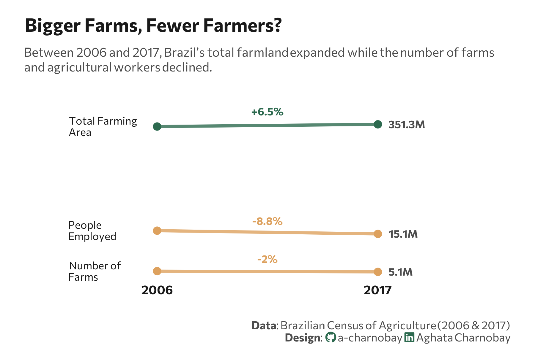
data <- tibble(
  category = c("total_area_farm_holdings", "n_farm_holdings", "n_occupied_people"),
  un = c("ha", "n", "n"),
  y_2006 = c(329941393, 5175489, 16568205),
  y_2017 = c(351289816, 5073324, 15105125)
)
1.3 Set theme
# Font setup
font_add_google("Commissioner")
showtext_auto()
showtext_opts(dpi = 300)
font_main <- "Commissioner"

# Font Awesome for caption
font_add(family = "fa-brands", regular = here("fonts", "Font Awesome 7 Brands-Regular-400.otf"))

# Colors
title_col <- "grey10"
text_col  <- "grey30"
bg_col    <- "#F2F4F8"

col_increase <- "#2D6A4F"
col_decrease <- "#dda15e"
2 Prepare data for plotting
df <- data%>%
  mutate(
    category = case_match(
      category,
      "total_area_farm_holdings" ~ "Total Farming\nArea",
      "n_farm_holdings"          ~ "Number of\nFarms",
      "n_occupied_people"        ~ "People\nEmployed",
      .default = category
    ),
    pct_change = ((y_2017 - y_2006) / y_2006) * 100,
    label_pct = paste0(ifelse(pct_change > 0, "+", ""), round(pct_change, 1), "%"),
    line_color = ifelse(pct_change > 0, col_increase, col_decrease)
  ) %>%
  pivot_longer(cols = c(y_2006, y_2017), names_to = "year", values_to = "value") %>%
  mutate(
    year = str_replace(year, "y_", ""),
    value_label = label_number(accuracy = 0.1, scale_cut = cut_short_scale())(value)
  )
3 Plot
p <- ggplot(df, aes(x = year, y = value, group = category)) +
# Slope lines
geom_line(aes(color = line_color), size = 1.2, alpha = 0.8) +
# Endpoints
geom_point(aes(color = line_color), size = 2.5) +
# Category Names
geom_text(
data = df %>% filter(year == "2006"),
aes(label = category),
x = 0.6,
hjust = 0,
vjust = 0.5,
lineheight = 0.9,
family = font_main,
size = 3,
color = title_col
) +
# Abbreviated Values
geom_text(
data = df %>% filter(year == "2017"),
aes(label = value_label),
x = 2.05,
hjust = 0,
family = font_main,
size = 3,
color = text_col,
fontface = "bold"
) +
# Percentage Change
geom_text(
data = df %>% filter(year == "2017"),
aes(label = label_pct, color = line_color),
x = 1.5,
vjust = -1.2,
family = font_main,
size = 3,
fontface = "bold"
) +
scale_color_identity() +
scale_y_log10() +
labs(
title = "Bigger Farms, Fewer Farmers?",
subtitle = "Between 2006 and 2017, Brazil’s total farmland expanded while the number of farms<br>and agricultural workers declined.",
caption = paste0(
"**Data**: Brazilian Census of Agriculture (2006 & 2017)",
"<br>**Design**: <span style='font-family:fa-brands; color:#2D6A4F;'></span> a-charnobay ",
"<span style='font-family:fa-brands; color:#2D6A4F;'></span> Aghata Charnobay"
)
) +
coord_cartesian(clip = "off") +
# styling
theme_minimal(base_family = font_main) +
theme(
plot.title = element_text(face = "bold", size = 15, color = title_col, margin = margin(t = 5, b = 10)),
plot.subtitle = element_markdown(size = 10, color = text_col, margin = margin(b = 35), lineheight = 1.2),
plot.title.position = "plot",
plot.caption = element_markdown(size = 9, color = text_col, lineheight = 1.1, margin = margin(t = 20)),
plot.background = element_rect(fill = "white", color = NA),
panel.background = element_rect(fill = "white", color = NA),
plot.margin = margin(10, 20, 10, 20), # Added more margin to prevent clipping
panel.grid = element_blank(),
axis.text.y = element_blank(),
axis.title = element_blank(),
axis.text.x = element_text(size = 10, face = "bold", color = title_col),
legend.position = "none"
)