library(tidytext)
library(ggtext)
library(showtext)
library(stringr)
library(tidyverse)
library(here)
library(readxl)
library(scales)
library(patchwork)09.Wealth
Distributions
1 Setup
1.1 Load R packages
1.2 Load data
gdp_brazil <- read_excel("gdp_brazil.xlsx")1.3 Set theme
# Font setup
font_add_google("Commissioner")
showtext_auto()
showtext_opts(dpi = 300)
font_main <- "Commissioner"

# Font Awesome for caption
font_add(family = "fa-brands", regular = here("fonts", "Font Awesome 7 Brands-Regular-400.otf"))

# Colors
title_col <- "grey10"
text_col  <- "grey30"
bg_col    <- "#F2F4F8"

col_agro  <- "#2D6A4F"
col_other <- "#D8E3E0"

col_inputs  <- "#2D6A4F"
col_farming <- "#2D6A4F"
col_industry<- "#2D6A4F"
col_services<- "#2D6A4F"
2 Prepare data for plotting
df_total <- gdp_brazil %>%
  mutate(Rest_of_Economy = 1 - agriculture_gdp_share) %>%
  rename(Agribusiness = agriculture_gdp_share) %>%
  select(year, Agribusiness, Rest_of_Economy) %>%
  pivot_longer(cols = -year, names_to = "Sector", values_to = "Share") %>%
  mutate(Sector = factor(Sector, levels = c("Rest_of_Economy","Agribusiness")))

df_sectors <- gdp_brazil %>%
  select(
    year,
    agro_inputs_share,
    primary_agriculture_share,
    agro_industry_share,
    agro_services_share
  ) %>%
  rename(
    Inputs = agro_inputs_share,
    Farming = primary_agriculture_share,
    Industry = agro_industry_share,
    Services = agro_services_share
  ) %>%
  pivot_longer(-year, names_to = "Sector", values_to = "Share")
3. Plot
## Plot 1
p1 <- ggplot(df_total, aes(x = year, y = Share, fill = Sector)) +
geom_area(alpha = 0.9, color = "white", linewidth = 0.1) +
scale_y_continuous(
labels = label_percent(),
expand = c(0,0),
breaks = seq(0,1,0.25)
) +
scale_x_continuous(
expand = c(0,0),
breaks = seq(1996,2024,4)
) +
scale_fill_manual(
values = c(
"Rest_of_Economy" = col_other,
"Agribusiness" = col_agro
)
) +
labs(
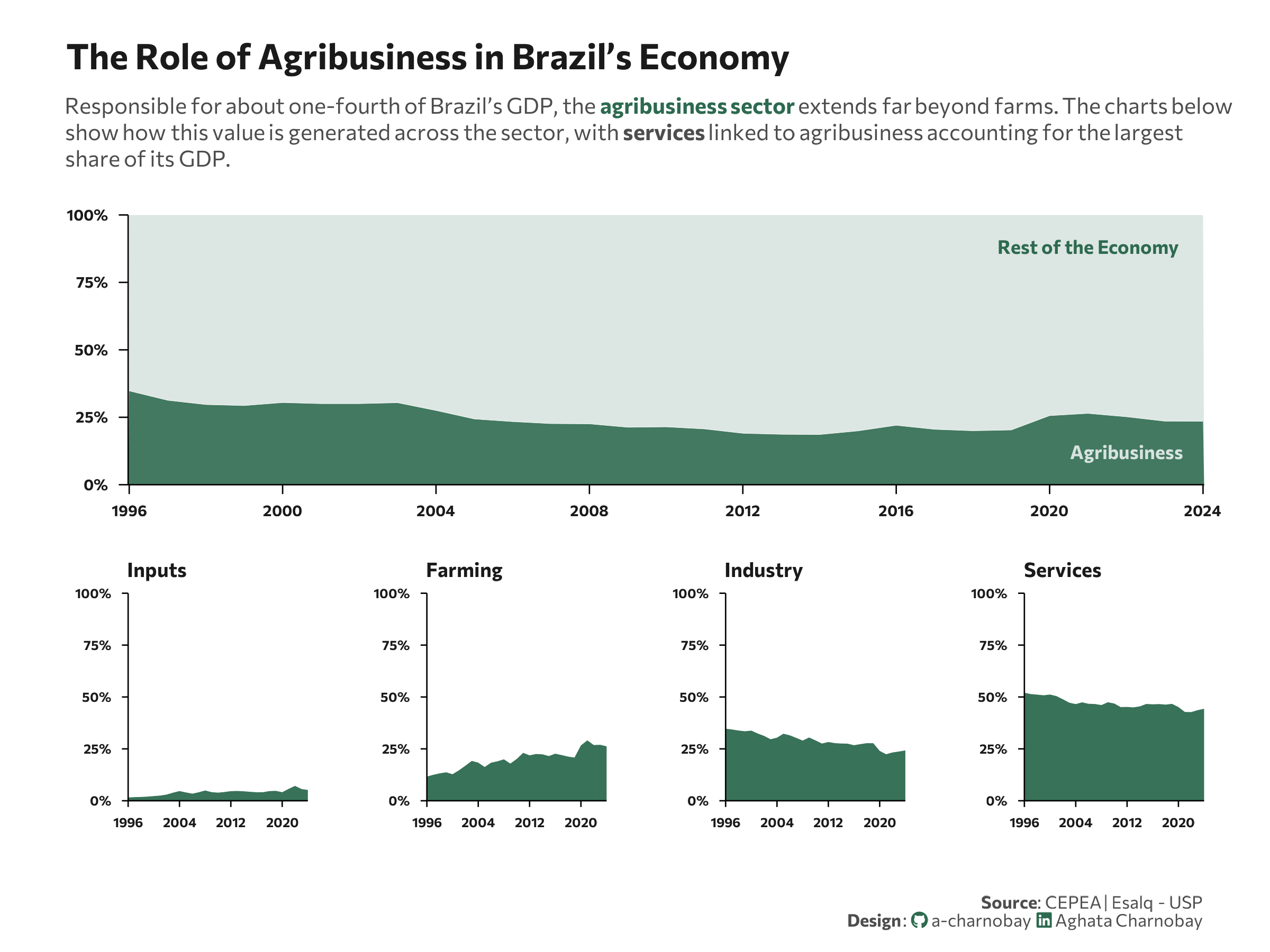
title = "The Role of Agribusiness in Brazil’s Economy",
subtitle = paste0(
"Responsible for about one-fourth of Brazil’s GDP, the ",
"<span style='color:", col_agro, ";'><b>agribusiness sector</b></span> extends far beyond farms. The charts below<br>",
"show how this value is generated across the sector, with ",
"<b>services</b> linked to agribusiness accounting for the largest<br>",
"share of its GDP."
),
x = NULL,
y = NULL
) +
theme_minimal(base_family = font_main) +
theme(
axis.line = element_line(color = "black", linewidth = 0.3),
axis.ticks = element_line(color = "black", linewidth = 0.3),
axis.ticks.length = unit(0.15,"cm"),
panel.grid = element_blank(),
plot.title.position = "plot",
plot.title = element_text(face = "bold", size = 16, color = title_col, margin = margin(b=10)),
plot.subtitle = element_markdown(size = 10, color = text_col, margin = margin(b=20), lineheight = 1.2),
axis.text.x = element_text(size = 7, face = "bold", color = title_col),
axis.text.y = element_text(size = 7, face = "bold", color = title_col),
legend.position = "none"
) +
annotate(
"text",
x = 2022,
y = 0.12,
label = "Agribusiness",
family = font_main,
fontface = "bold",
color = col_other,
size = 3
) +
annotate(
"text",
x = 2021,
y = 0.88,
label = "Rest of the Economy",
family = font_main,
fontface = "bold",
color = col_agro,
size = 3
)
## Plot 2
small_area <- function(dataset, sector_name, color){
df_plot <- dataset %>%
filter(Sector == sector_name)
ggplot(df_plot, aes(year, Share)) +
geom_area(fill = color, alpha = 0.95) +
scale_y_continuous(
limits = c(0, 1),
labels = label_percent(),
breaks = seq(0, 1, 0.25),
expand = c(0, 0)
) +
scale_x_continuous(
expand = c(0,0),
breaks = seq(1996,2024,8)
) +
labs(
title = sector_name,
x = NULL,
y = NULL
) +
theme_minimal(base_family = font_main) +
theme(
panel.grid = element_blank(),
axis.line = element_line(color="black",linewidth=0.3),
axis.text = element_text(size=6,face="bold",color=title_col),
axis.ticks = element_line(color="black",linewidth=0.3),
axis.ticks.length = unit(0.1,"cm"),
plot.title = element_text(
size=9,
face="bold",
color=title_col,
hjust=0
)
)
}
p_inputs <- small_area(df_sectors,"Inputs",col_inputs)
p_farm <- small_area(df_sectors,"Farming",col_farming)
p_ind <- small_area(df_sectors,"Industry",col_industry)
p_serv <- small_area(df_sectors,"Services",col_services)
p <- p1 /
(p_inputs | p_farm | p_ind | p_serv) +
plot_layout(heights = c(1.3,1))
p <- p +
plot_annotation(
caption = paste0(
"**Source**: CEPEA | Esalq - USP",
"<br>**Design**: <span style='font-family:fa-brands; color:#2D6A4F;'></span> a-charnobay ",
"<span style='font-family:fa-brands; color:#2D6A4F;'></span> Aghata Charnobay"
)
) &
theme(
plot.caption = element_markdown(
size = 8, family = font_main,
color = text_col,
margin = margin(t = 20)
),
plot.margin = margin(10, 15, 10, 15)
)