library(tidytext)
library(ggtext)
library(showtext)
library(stringr)
library(tidyverse)
library(here)
library(sidrar)
library(ggridges)05.Experimental
Comparisons
Heatmap
1 Setup
1.1 Load R packages
1.2 Load data
info <- info_sidra("6780")
#names(info)
#info$classific_category

dados <- get_sidra(x = 6780,
                   variable = "all",
                   classific = "c220",
                   category = list("all"),
                   geo = "State")

dados_clean <- dados |>
  select(`Unidade da Federação`, `Grupos de área total`, `Valor`)
1.3 Set theme
# Font setup
font_add_google("Commissioner")
showtext_auto()
showtext_opts(dpi = 300)
font_main <- "Commissioner"

# Font Awesome for caption
font_add(family = "fa-brands", regular = here("fonts", "Font Awesome 7 Brands-Regular-400.otf"))

# Colors
title_col <- "grey10"
text_col  <- "grey30"
bg_col    <- "#F2F4F8"

pal_mint   <- "#f2f0e5"
pal_peach  <- "#d9c4ab"
pal_sage   <- "#adc2a9"
pal_forest <- "#5e8071"
pal_deep   <- "#2d4439"
2 Prepare data for plotting
translation_map <- c(
  "Mais de 0 a menos de 0,1 ha"    = "< 0.1 ha",
  "De 0,1 a menos de 0,2 ha"       = "0.1–0.2 ha",
  "De 0,2 a menos de 0,5 ha"       = "0.2–0.5 ha",
  "De 0,5 a menos de 1 ha"         = "0.5–1 ha",
  "De 1 a menos de 2 ha"           = "1–2 ha",
  "De 2 a menos de 3 ha"           = "2–3 ha",
  "De 3 a menos de 4 ha"           = "3–4 ha",
  "De 4 a menos de 5 ha"           = "4–5 ha",
  "De 5 a menos de 10 ha"          = "5–10 ha",
  "De 10 a menos de 20 ha"         = "10–20 ha",
  "De 20 a menos de 50 ha"         = "20–50 ha",
  "De 50 a menos de 100 ha"        = "50–100 ha",
  "De 100 a menos de 200 ha"       = "100–200 ha",
  "De 200 a menos de 500 ha"       = "200–500 ha",
  "De 500 a menos de 1.000 ha"     = "500–1k ha",
  "De 1.000 a menos de 2.500 ha"   = "1k–2.5k ha",
  "De 2.500 a menos de 10.000 ha"  = "2.5k–10k ha",
  "De 10.000 ha e mais"            = "> 10k ha"
)

dados_final <- dados |>
  select(state = `Unidade da Federação`, group = `Grupos de área total`, value = Valor) |>
  filter(group %in% names(translation_map)) |>
  mutate(
    area_en = factor(translation_map[group], levels = unname(translation_map)),
    value = as.numeric(value),
    # Assign Regions
    Region = case_when(
      state %in% c("Acre", "Amapá", "Amazonas", "Pará", "Rondônia", "Roraima", "Tocantins") ~ "North",
      state %in% c("Alagoas", "Bahia", "Ceará", "Maranhão", "Paraíba", "Pernambuco", "Piauí", "Rio Grande do Norte", "Sergipe") ~ "Northeast",
      state %in% c("Distrito Federal", "Goiás", "Mato Grosso", "Mato Grosso do Sul") ~ "Center-West",
      state %in% c("Espírito Santo", "Minas Gerais", "Rio de Janeiro", "São Paulo") ~ "Southeast",
      state %in% c("Paraná", "Rio Grande do Sul", "Santa Catarina") ~ "South"
    ),
    Region = factor(Region, levels = c("North", "Northeast", "Center-West", "Southeast", "South"))
  ) |>
  # sorting logic
  arrange(Region, desc(state)) |>
  mutate(state = fct_inorder(state)) |>
  group_by(state) |>
  mutate(value_norm = value / max(value, na.rm = TRUE)) |>
  ungroup()
3. Plot
p<- ggplot(dados_final, aes(x = area_en, y = state, fill = value_norm)) +
geom_tile(color = "white", size = 0.3) +
scale_fill_stepsn(
colors = c(pal_mint, pal_peach, pal_sage, pal_forest, pal_deep),
breaks = c(0.05, 0.15, 0.35, 0.65, 0.85),
labels = scales::percent,
name = "Concentration",
na.value = pal_mint,
guide = guide_colorsteps(barwidth = 15, barheight = 0.4)
) +
# Regional grouping with spacing
facet_grid(Region ~ ., scales = "free_y", space = "free_y", switch = "y") +
labs(
title = "How Farm Sizes Vary Across Brazilian States",
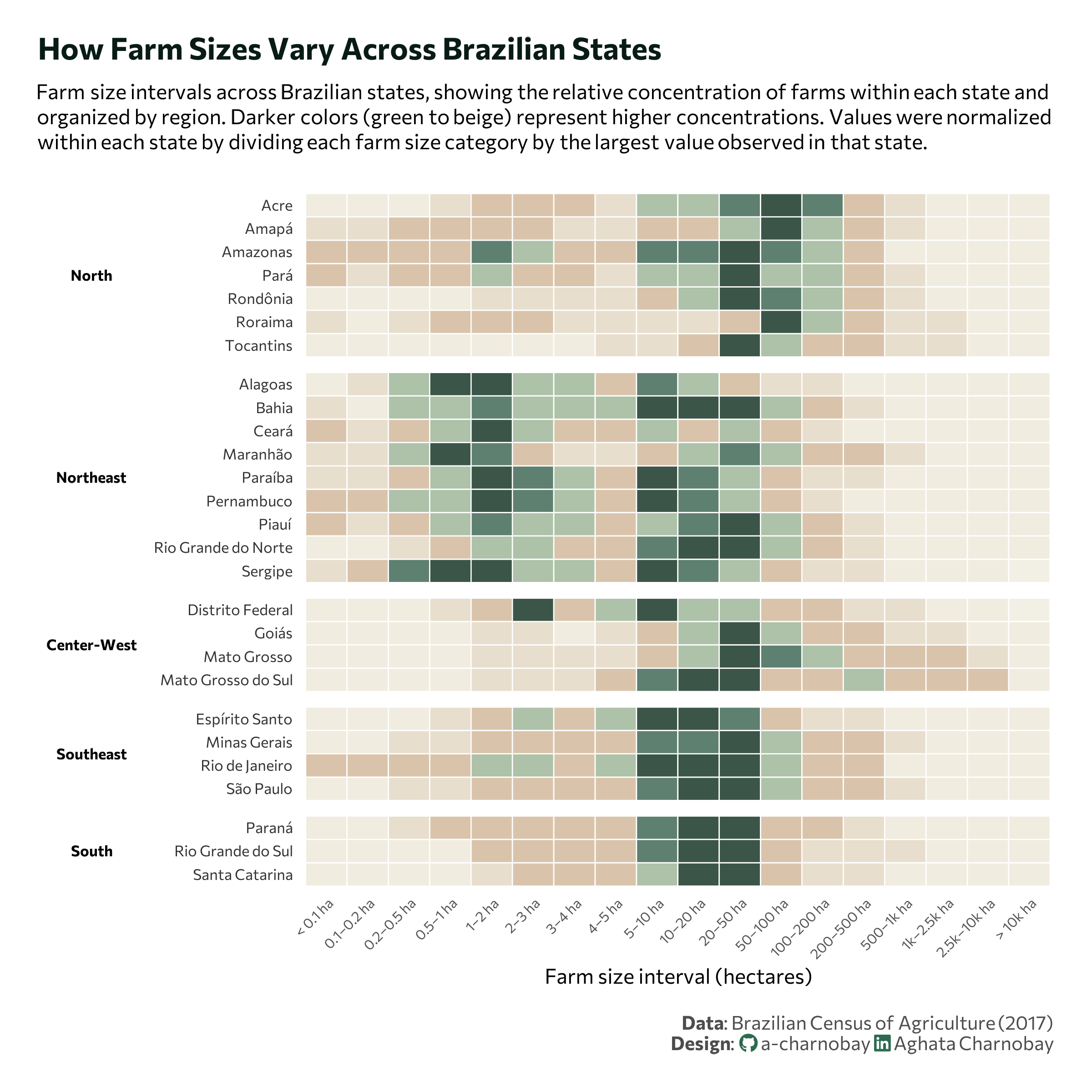
subtitle = "Farm size intervals across Brazilian states, showing the relative concentration of farms within each state and<br>organized by region. Darker colors (green to beige) represent higher concentrations. Values were normalized<br>within each state by dividing each farm size category by the largest value observed in that state.",
x = "Farm size interval (hectares)",
y = NULL,
caption = paste0(
"**Data**: Brazilian Census of Agriculture (2017)",
"<br>**Design**: <span style='font-family:fa-brands; color: #2D6A4F;'></span> a-charnobay ",
"<span style='font-family:fa-brands; color:#2D6A4F;'></span> Aghata Charnobay"
)
) +
# styling
theme_minimal(base_family = font_main) +
theme(
strip.placement = "outside",
strip.text.y.left = element_text(angle = 0, face = "bold", size = 8, color = "black"),
strip.background = element_rect(color = NA),
plot.title.position = "plot",
plot.caption.position = "plot",
axis.text.x = element_text(angle = 45, hjust = 1, size = 7.5, color = "#555555"),
axis.text.y = element_text(size = 8, color = "#333333"),
plot.title = element_text(face = "bold", size = 16, color = "#081c15", hjust = 0,margin = margin(b=10) ),
plot.subtitle = element_markdown(size = 11, margin = margin(b=20), hjust = 0, lineheight = 1.2),
plot.caption = element_markdown(size = 10, color = text_col, lineheight = 1.1, margin = margin(t = 15)),
panel.grid = element_blank(),
panel.spacing.y = unit(0.4, "lines"),
legend.position = "none",
plot.margin = margin(20, 20, 20, 20)
)